
Finding the lens’s sweet spot
Where does your lens perform best?

- Top Tenerife Locations for Landscape Photography - January 18, 2017
- Tokina 11-16 vs Tokina 11-20 sun flares comparison - August 8, 2016
- How (NOT) to take a picture of the Sun - January 28, 2016
Everybody likes nice, sharp pictures when it comes to landscape photography. Photographers routinely spend large amount of money to buy the best-performing lens in order to get decent shots. Even many of those who own top-quality lenses often do not know where their lenses perform best. It’s actually rather funny that the lens manufacturer doesn’t provide a lens performance guide in the lens manual. Never mind that! We’ll be walking through finding your lens’s sweet spot in the coming paragraphs.
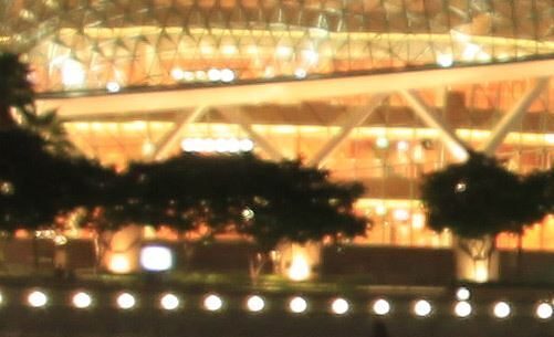
I had my “a-ha moment” in Singapore. I was taking a night time picture in Marina Bay with lens Sigma 18-250 f3.6-6.2 DC OS. When I looked at the 100% detail, it was far from sharp. I used my tripod and delayed shutter but it looked very bad:
18mm – F3.5 – ISO 200
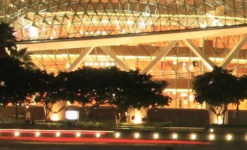
I wasn’t happy at all. I wanted a nice, sharp picture. I don’t know why, but I somehow intuitively changed the aperture to F8 and surprise! The picture was much better!
18mm – F8 – ISO 200
Since then, I have learned the sweet spots of all my lenses and use them whenever it’s convenient. It’s not always the best option for getting the shot you like, but it comes in handy to know this information about your lenses.
How you can find out about your lens? There are two ways:
1. Test your lens yourself!
This is the best way to get acquainted with the lens you already have. Sharpness can vary with every single piece, even from the same model. If you test your lens yourself, you will have no doubts.
Here is how you do it:

- Find a brick wall, especially on a bright day with direct sunshine
- Place your camera on a tripod in front of the wall
- Manually focus in LiveView
- Use remote control or delayed shutter
- Switch to A mode
- Use RAW or the highest quality/resolution JPG
- Take a series of shots from lowest to highest F-number
After this, you will have a series of pictures that’s basically the same. Now, you have to look at the details at 100% zoom. Then, you have to look at each picture, one-by-one, in the centre and in the corner.
The easiest way to analyze each image is through software like Lightroom or Photoshop. Make a crop in the centre and in the corner, synchronize the settings for all pictures, and export each one as a high-quality JPG.

Cropping and exporting them, you will get small pictures like these:


2. Look up test results on specialised websites
There are a lot of people reviewing lenses and photography gear, but there are just a few really dedicated sites with a broad spectrum of lenses and cameras. I use them often, especially if I want to buy a new lens, to find out about what I need.
One of the best sites is Photozone.de. They have tested a large number of lenses from all major manufacturers and formats, starting with micro Four/Third and ending with Full Frame. Whatever camera you have with an interchangeable lens, you’ll most likely be able to find it there.
After you find your lens and click on the review, you’ll be shown a graph. It’s bit technical, so I will explain what you’re look at. They measure the lens’s performance in various categories, but I will write about these three main ones: Sharpness, Vignetting and Chromatic Aberration.
When we look first at the Sharpness graph for the Tokina 11-16 F2.8 lens, we see this:
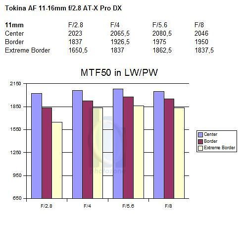
Confusing and too technical? No worries, I will explain. Don’t look at the numbers.
First look at at the top, there “focal length” is written in bold letters under the name of lens. This graph shows you the sharpness of this lens at the mentioned focal length. In this case, it’s 11mm.
Then you look at the graph and see a little explanation box on the right. It will tell you that different colours represent a different measured value for each part of the image. For the centre, it’s purple; violet represents the corner and yellow represents the extreme corner. On my test with the brick wall, I look at the corner and the extreme corner in one picture, just to keep it simple.
On the bottom, there is an F-number that represents the F-value set on the camera when the test picture was taken. To know how the lens performs at F2.8 compared to F5.6, for example, you have to look at the first and third column. There, you will get a perspective of how much difference there is between the two. In this case, you can see little a improvement in the centre part, but quite a significant improvement in the corner and extreme corner. This also confirms my measurement on the brick wall. When it comes to the zoom lens, there will be more graphs with a sharpness measurement at various focal lengths. It’s useful because when convenient, you can adjust to the focal length that is sharpest to get the best quality shot.
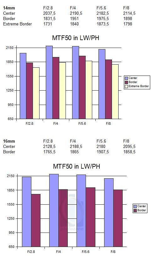
Here you can see an increase of sharpness in the 14mm and 16mm focal lengths. Knowing that might be useful in some situations.
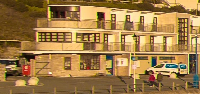
Next, we have a graph with Vignetting measurements. In plain language, vignetting refers to a drop in brightness toward the corners in comparison with the centre of the image. Here is an example of a shot taken with a lens that has strong vignetting:

On graph it looks like this:
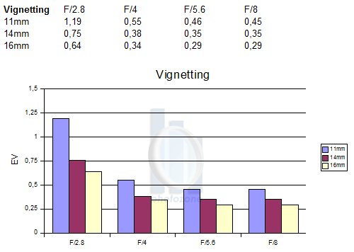
In this case, the lower the number, the better. As you can see, it’s most prevalent at F2.8; then, it reaches its lowest point at F8. Most people don’t even notice vignetting on their pictures. In most cases, it is insignificant or automatically corrected by te camera or in computer photo-editing software. Notice as well that the different colours on the graph represent different focal lengths.
Lastly, we have Chromatic Aberration. Again, in simple language, this means that tiny coloured lines appears on the high contrast edge. Here is an example from lens Tokina 11-16 f2.8, corner crop 100% at F4:
Colour may vary, but it’s usually purple or green. Every lens has some, but the good news is that it can be corrected with software or via the built-in function included in many cameras. Here is an example of the same picture with corrected chromatic aberration:
On the measurement graph, it looks like this:

On this graph, you can see that different colours represent different focal lengths. What it will also tell us is that this lens performs best when we are looking at chromatic aberration at F4, 11mm. I highly encourage you to have a look at Photozone.de to find the sweet spots of your lenses and remember where they perform best.
Have you found the sweet spot of your lens?
Leave us a comment to tell us which of these two described methods you used to find it.